How to make young people read more news?
In this task of 5 weeks, we were asked to use everything we had learned on the semester course ‘Screens’ (a 24p master course of interaction design that I had in my second semester. The name gives very much away! Visualization of data.), to choose a collaborator and design an appropriate user experience for the chosen task. Out of the ones we could choose from, I was the most intrigued by VG. What they wished for seemed simple, but turned out to be quite the challenge.
They asked us to use the content that VG or Aftenposten produces today as a starting point to explore different ways of communicating and visualising how to make more young users read more news. Is it a one-off news event? Or is a continuous story that evolves over time? Who are the actors in the story? What level of knowledge is needed to understand the content and the context? We could choose freely between text based articles, videos, podcasts and other types of media.
We were urged to challenge the status quo. A typical digital newspaper today is built up of a front page with links to different articles and videos. What are the alternatives? «Push the boundaries, explore crazy ideas, and create the news experience of tomorrow.» Were their wish.
As we were several people choosing this same task, and as many of the other students wanted to add to the existing apps/websites that VG offers, I was inspired to go in the opposite direction, and make something entirely new.
Of course, as we are taught, branding makes for a very big part of why people recognize a certain brand or service, and so I did not want to deviate too much from this. However, with the ‘no coding or technical limits’ as a designer tend to have when working alone, I could make an entirely blank slate on how the user were to experience the newspaper format.
Even though the user group brought it’s technical challenges and difficulties, including short focus spans and a high need for stimuli, they also had a really big advantage that I could make good use of: They don’t fear technology. They almost actually seem to leap into it. The only thing that could limit my making of a new UI was to make sure the UX also was looked after.
I made several interesting findings. Both that this is a user group that cares a lot what other people in the same user groups think of them, and that they would rather answer with ‘I don’t know’, rather than an answer that would turn out to be wrong. However, the would feel humiliated to not have an opinion of every current topic, and this was often a reason for them to avoid news entirely. When asked why they read news at all, the answer was often related to being on top of their game with their peers, rather than actually having a genuine interest for the worldview.
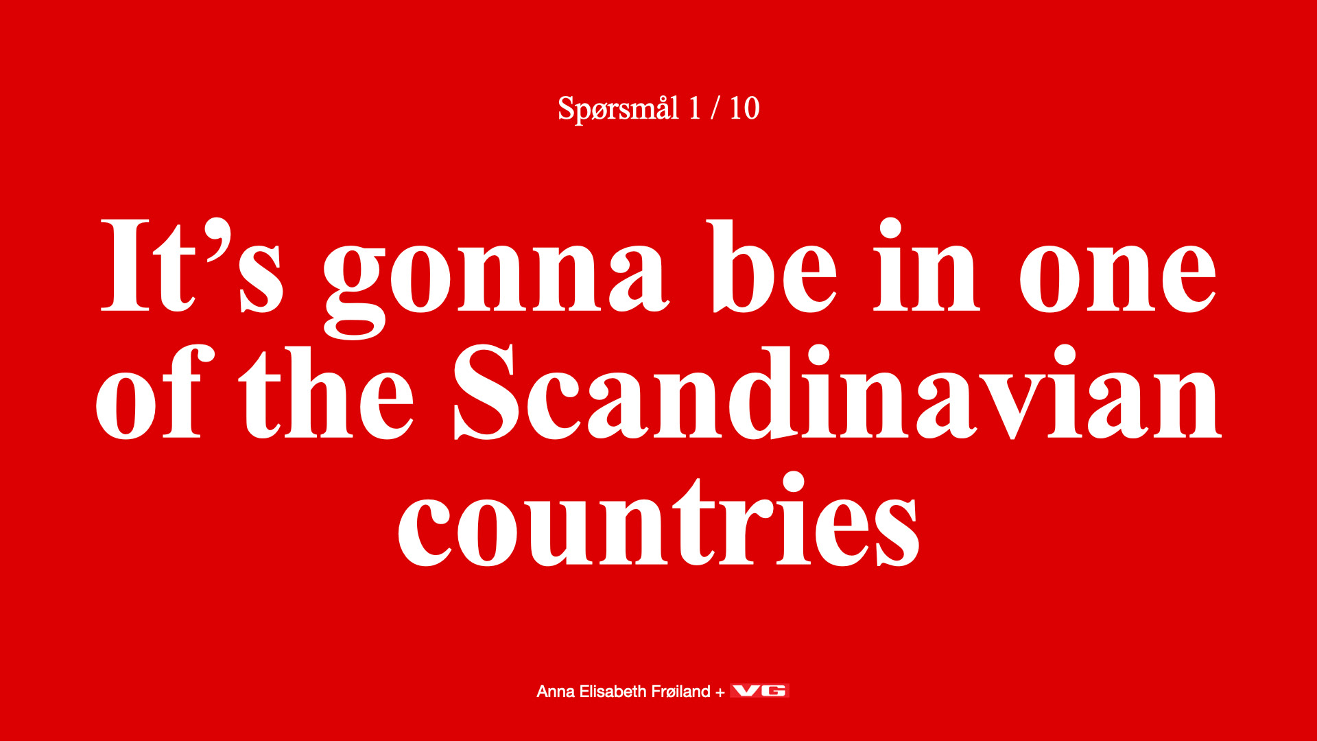
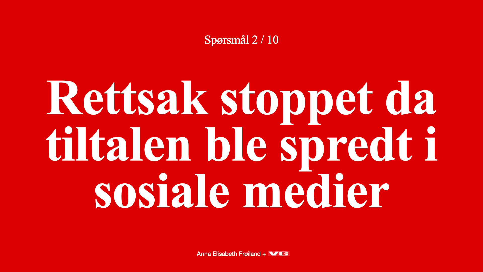
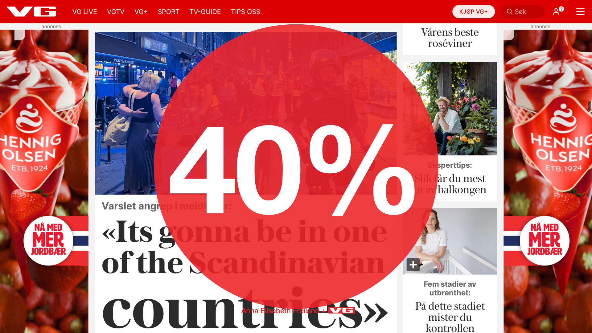
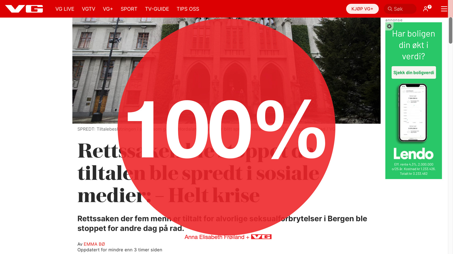
Even though they probably are willing to give a few more seconds than 10 seconds, I tried to do some testing to see if my hypothesis could make it to a prototype. I went on a mall, and asked young people if they could tell me what the headline indicated. I only took actual headlines that were published the exact same day from VG. The results showed me that even only 1-2 words could be enough, particularly if the subject was something ongoing, like a trial or leaks from misbehavior from the politicians of our country. . I did some UI testing on my instagram story:
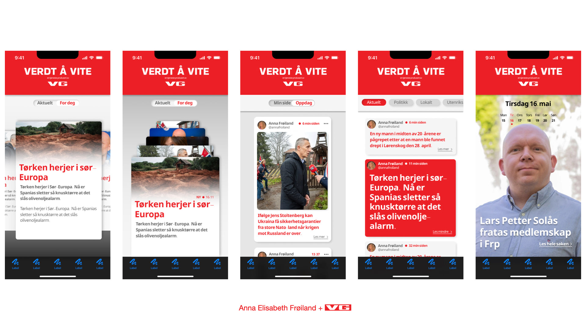
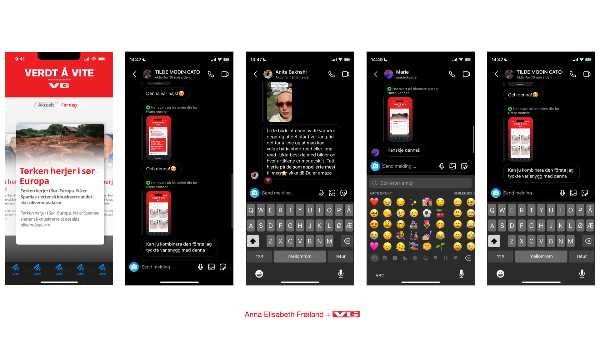
My strategy then became that in order for them to be able to read and understanding quickly and to be entertained while reading, I needed to make a product where the youths could feel informed enough to say ‘yes, I’ve heard’, or ‘yes I actually read about it today’. This would have to be on a familiar format with as little as possible information overload, maybe only 7-10 articles or topics a day, I needed to fill the most of the screen with visuals and images, rather than text, and my ultimate and very ambitious goal was to make them be able to read all of the topics for the day, in maximum 10 seconds. Some of the reason why this works today is because of the gigantic digital world that the young ones are exposed to today. Many media houses are good at meeting the users where they are, e.g. posting news on TikTok and snapchat. Snapchat even has entire stories that you can subscribe to to be updated.
And here also comes the question: How does my product stand out from snapchat? My final product is very much inspired by Peil, a news app for young people that was really good and to the point, but maybe a little ahead of its time. It’s main differences is using the vertical and horizontal scrolling in a different way from peil. And regarding snapchat, I would argue that VV is it’s entire own thing, being a strictly informal news app that makes you informed with only headlines, and it does not rely on audio to draw the users attention. Unlike Peil, which had a minimum of 10 articles a day, this would be an absolute max for VV, because the user would not want to keep up with anything that makes them feel like they HAVE to.
The finished product. VV by VG is a news app for young people that uses composite text, with large images and minimale amounts of text to inform and captivate it’s users. You can see all the articles of the day in just a short horizontal scroll. The interface is meant to challenge the way we have viewed newspapers in the past. If you enter ana article and leave it again when having only read the headlines, it will turn greyscale to indicate that you have read it. If you don’t even want to press the article you can simply take a quick scroll, and look at the tags in the top to see that who, what, when and where the article is about, giving subtle hints that may be enough for someone.
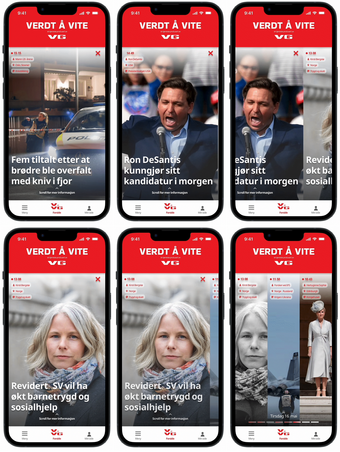
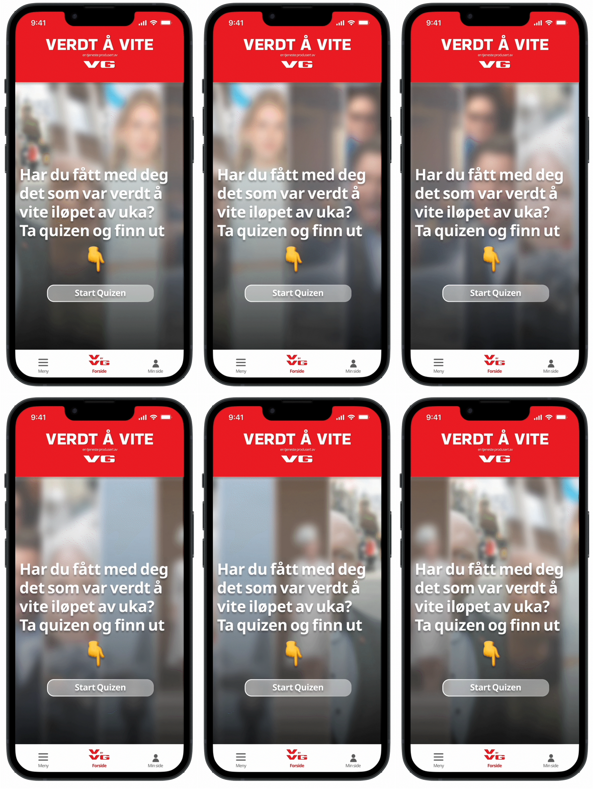
For those who wish, and to just take the product one step further, every week is ended with a quiz where you can test your skills. Again the colorscale indicates what you got right and not, but for me personally, I think the app in itself with the articles could be enough for this user group, leaving them fully aware of what they should know in the vorld view, and leaving them plenty of time to further explore what they want to know. Informal, visual, fast and straight to the point
Below is a one minute long video of the product in use:
