Visualizing data.
For this brief we were asked to come up with the best way to visualize advanced data. Our collaborator for this project was Arthings, a global tech company that sells a variety of products that helps you to measure the air quality around you. According to Airthings themselves they had mostly 'techy' users. How might we help change that?

As with most projects, you start with doing research and scoping. From here I quickly decided I was interested in the short time cognitive impairment when being exposed to too much CO2 over a long time.
When we go to bed without providing ourselves with good and consistent ventilation of the air we sleep in, is when we usually are exposed to too high CO2 levels, and thus the consequences that come with it.
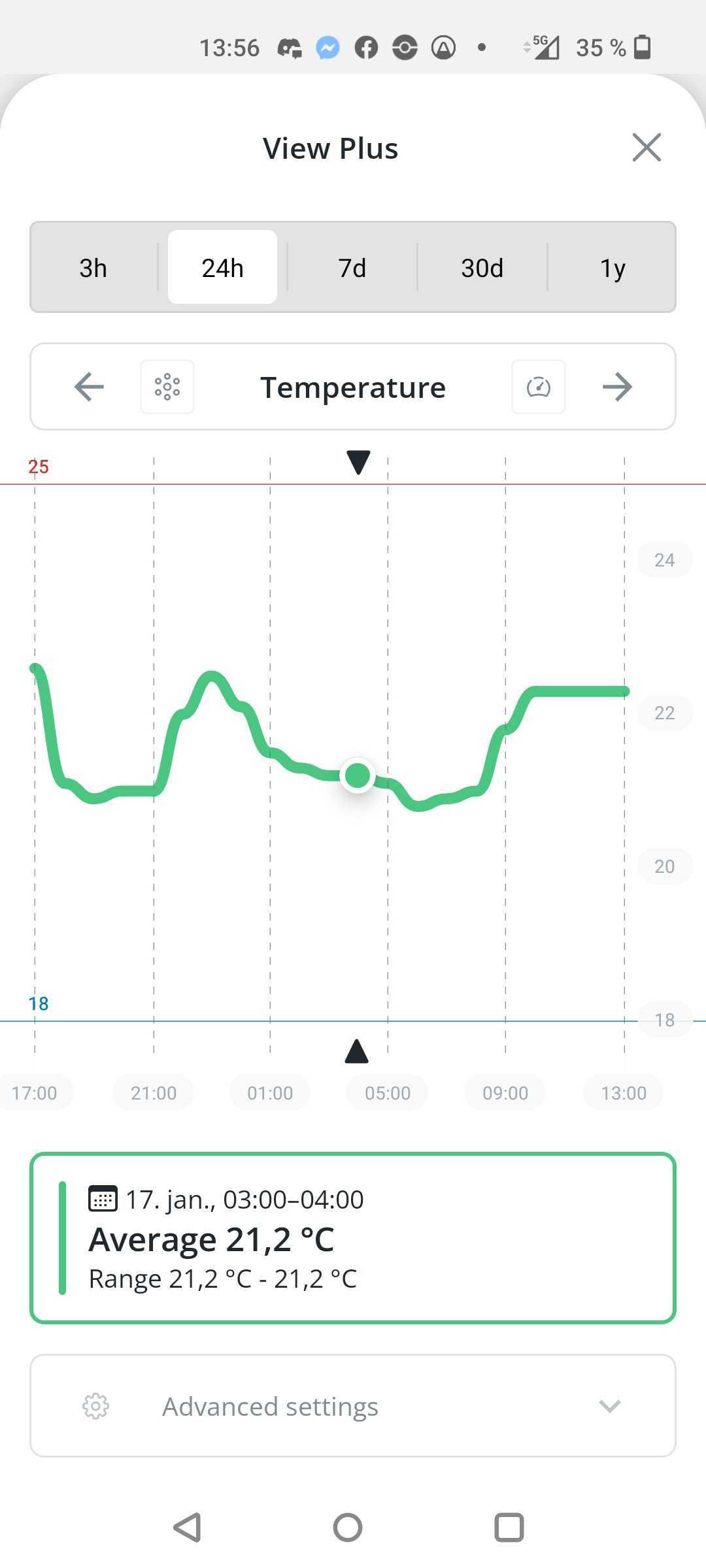
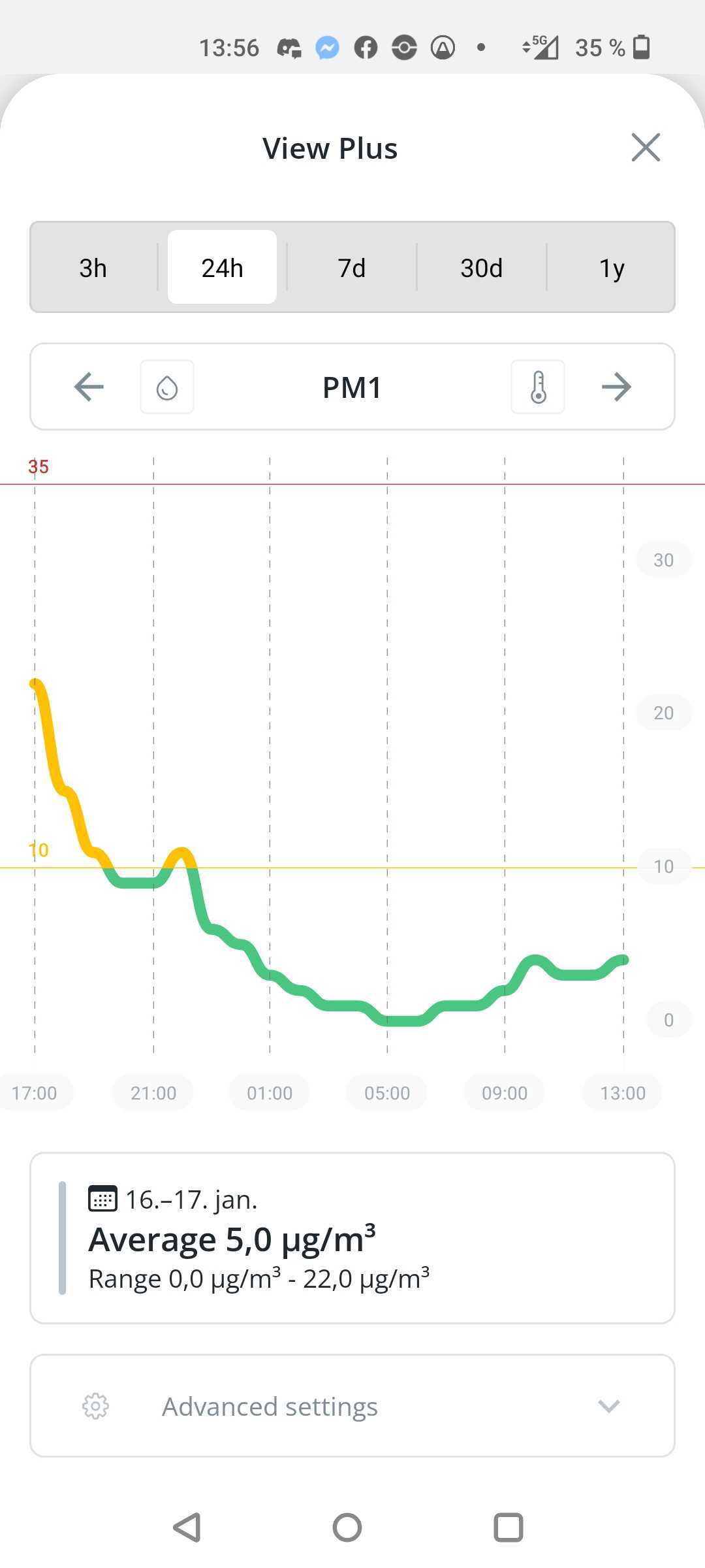
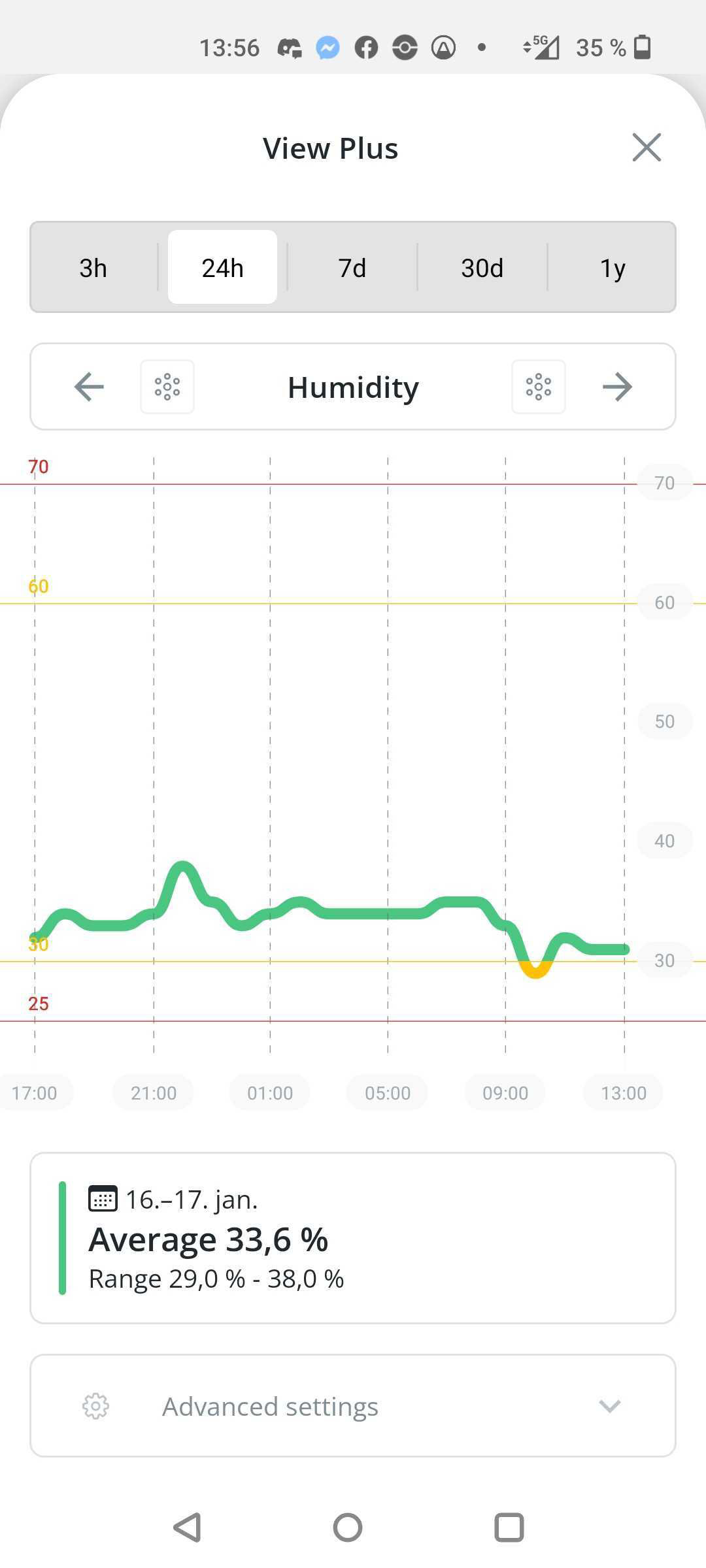
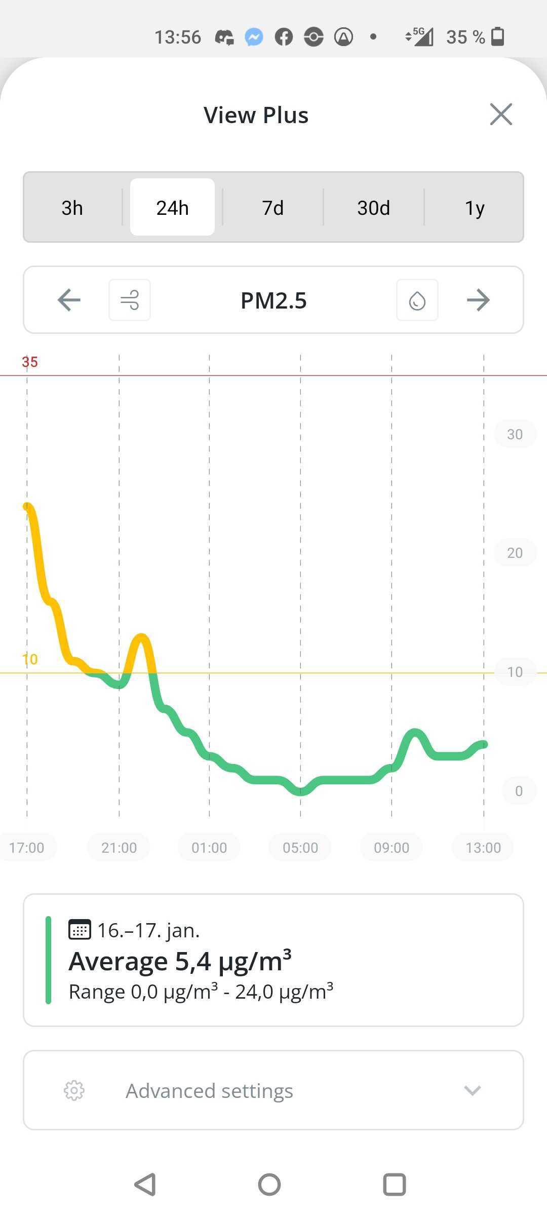

(Example of existing app and how they convey their data to the individual user.)
I understood rather quickly that in order to claim high levels of CO2 cause short term cognitive impairment like headaches and fatigue, I had to do extensive testing on myself, and with little time and only one night of using the Airthing Plus device we had been lended, I shifted my focus slightly.
Cause sometimes during these two weeks, I would still wake up like this
->
And I was not able to tell if it were due to CO2 levels or not. Other factors might very well have been noise/sound, light exposure, humidity and temperature.
And I figured I would have to choose, and facilitate for better sleep in the 'easiest' way possible, a way that was still comprehendible to the less techy customer they wanted to reach.
Someone who's main goal was to get a good night sleep and wake up like this
<-
I decided to keep as much of the existing interface as possible, and try to build on that. Our mentor ensured us: This is not a brief where you are supposed to make something entirely new, just for you to practice visualizing data.
So I made it my mission: Visualize data, but still challenge myself. And then the ever occurring question for a UI designer:
Does it have to be displayed on a screen?
It certainly does not!
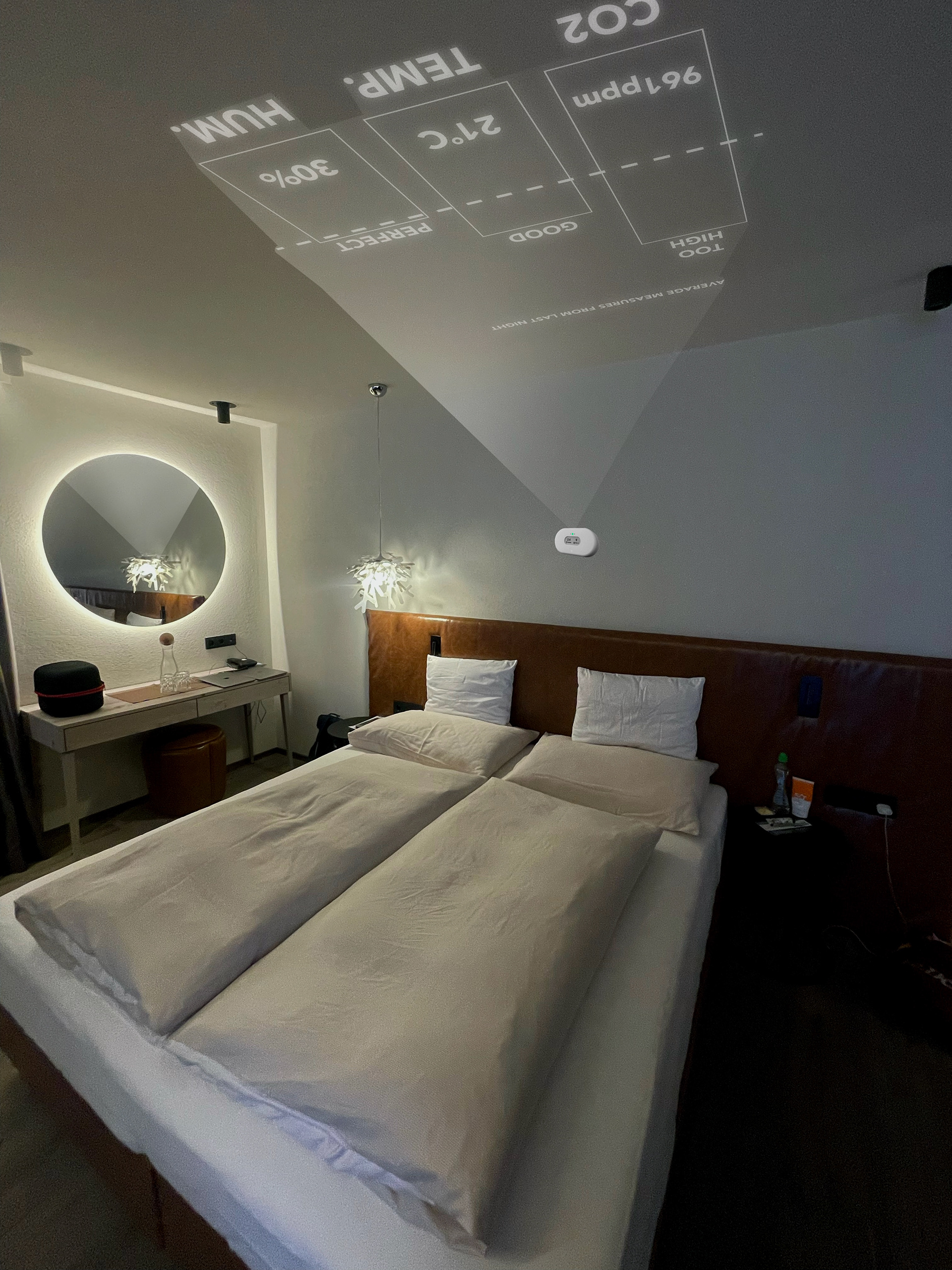
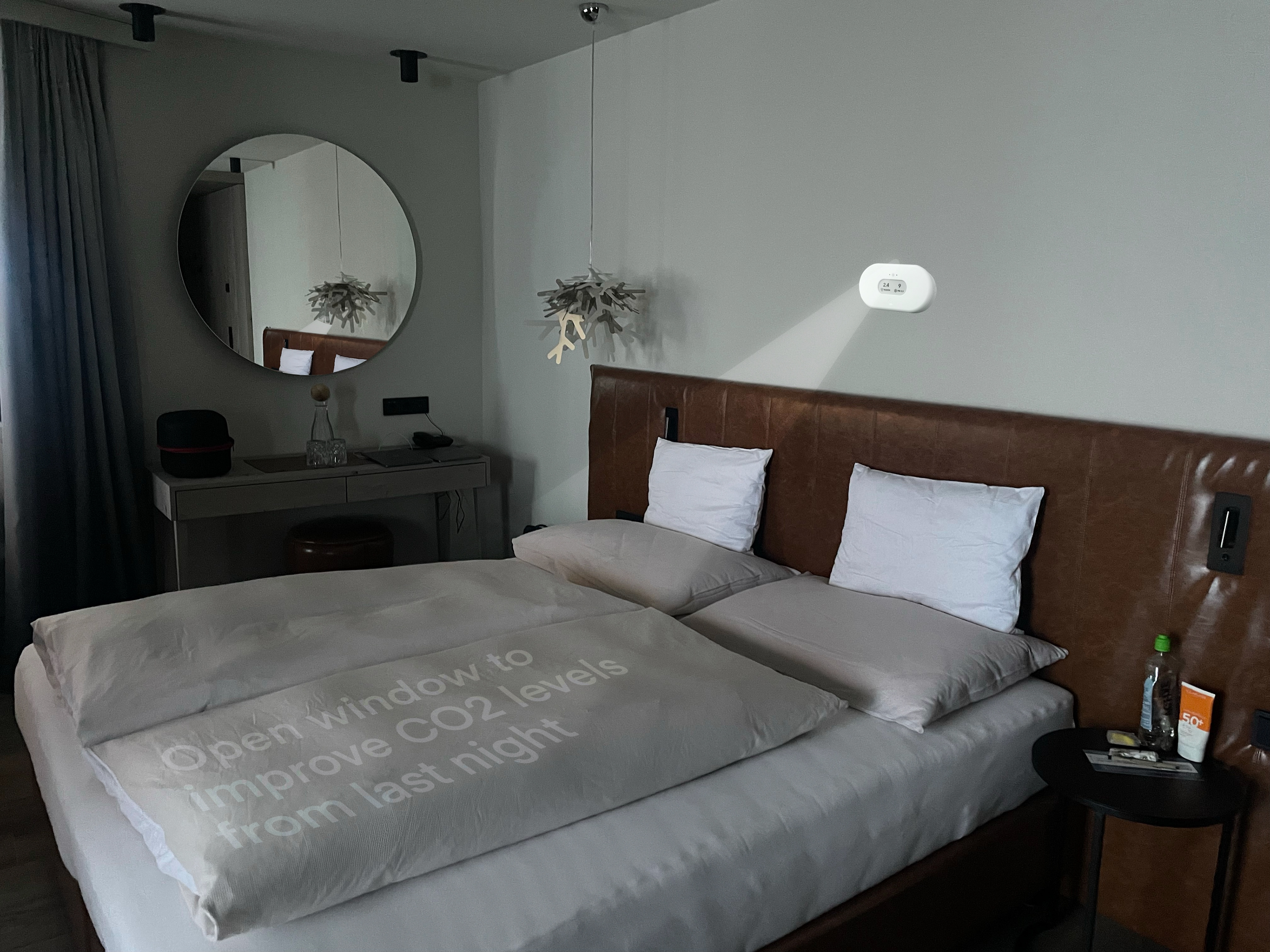
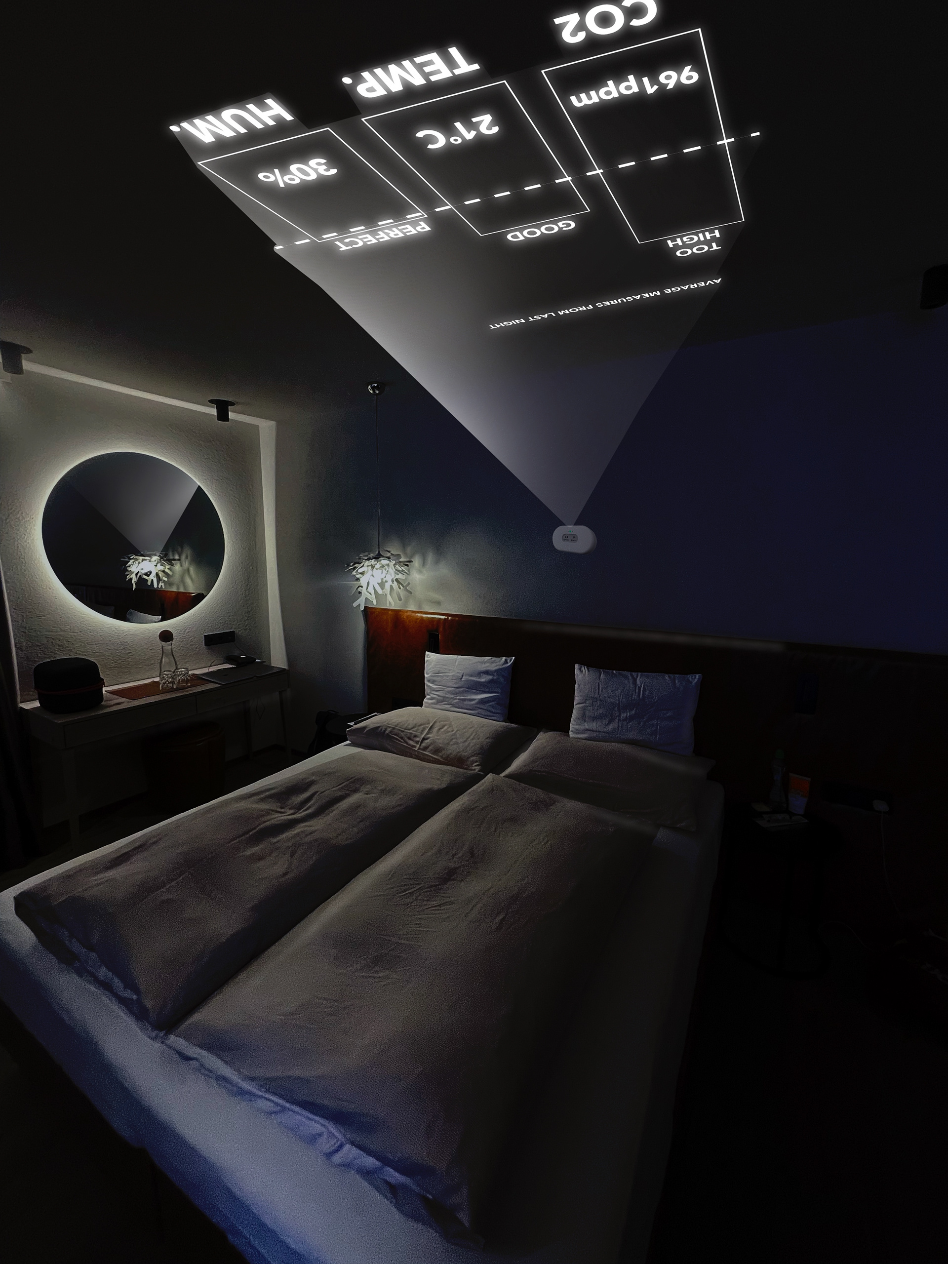
It can be displayed anywhere, now that the new and improved View Plus Sleep has a build in projector!
The way it works is simple. Since the device and the app is mostly the same as before, the only thing you have to do is set up your desired sleep schedule in the app once, and it will facilitate good sleeping habits for you in the evening, based on you stats from the night before, which is will also showcase for you in the morning.

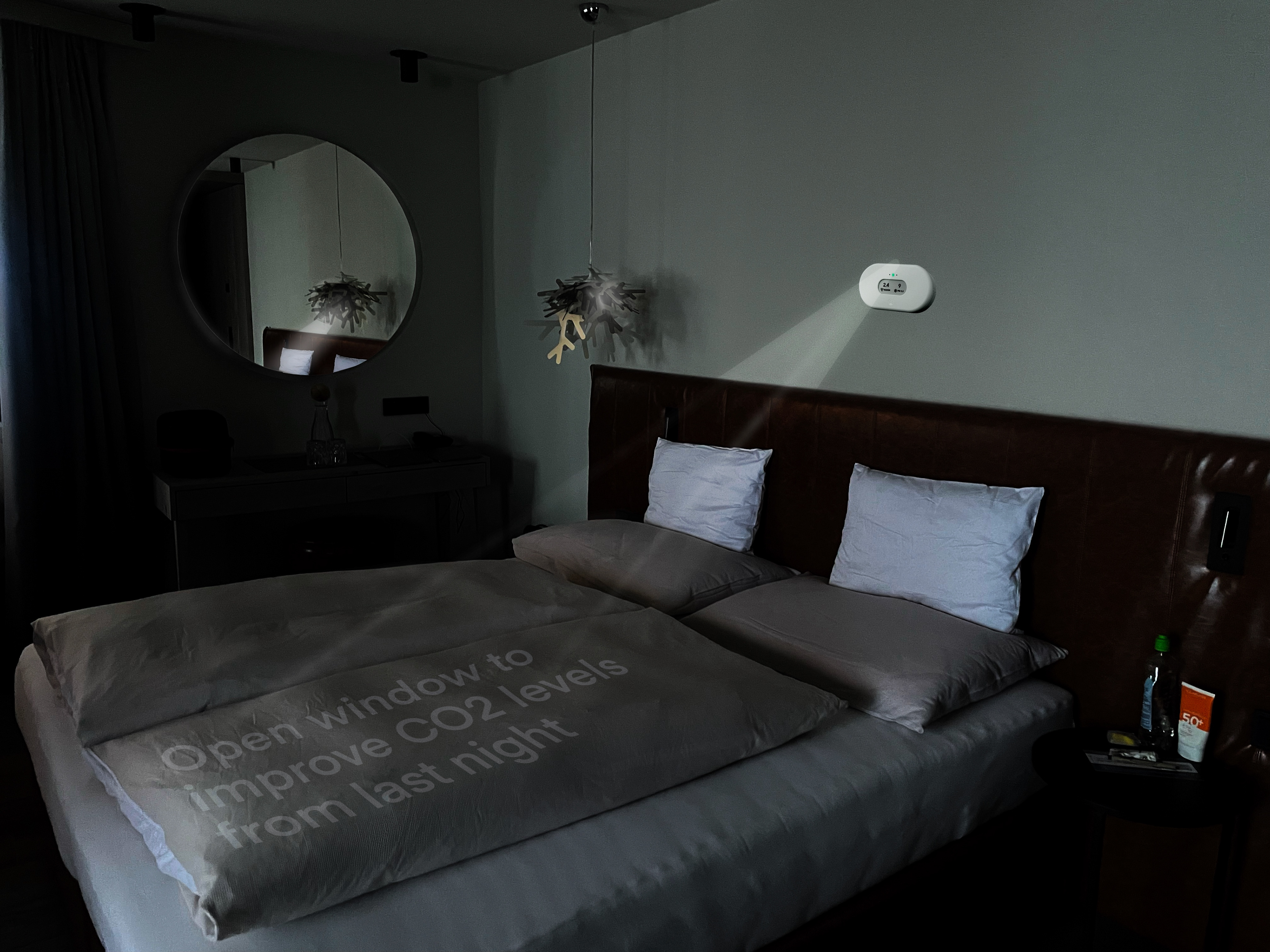
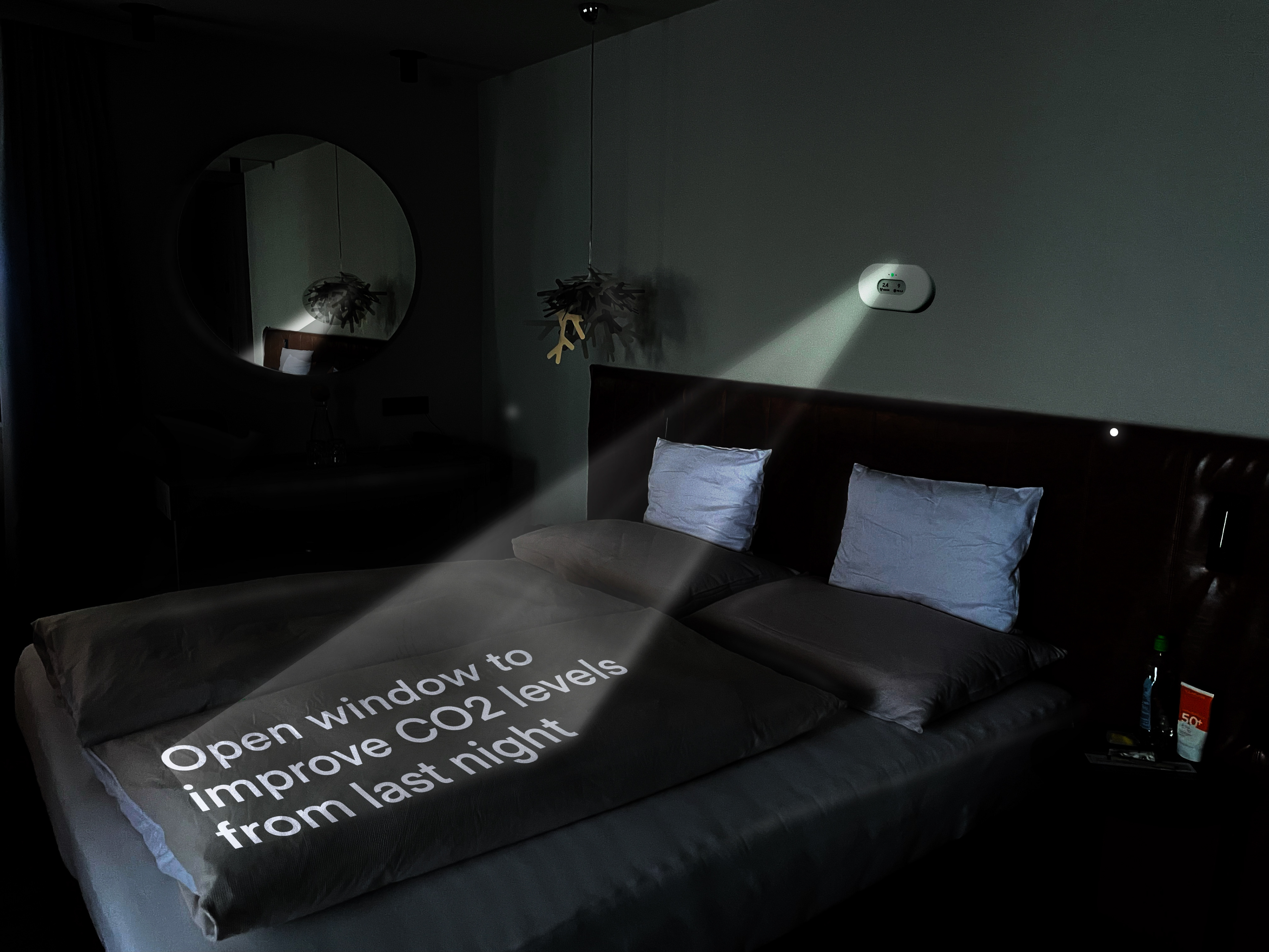
It all starts with the user placing the contact areas for waking up, and calming down to your bedroom. This user has chosen their bed as a canvas to calm down (which also gives a great push to always making your bed in the morning!) and the ceiling as the canvas for their morning stats. The morning stats also functions as a natural light alarm clock, as it brightens over the course of 30 minutes before the users desired wake up time. It will then disappear from the ceiling after another 30 minutes.
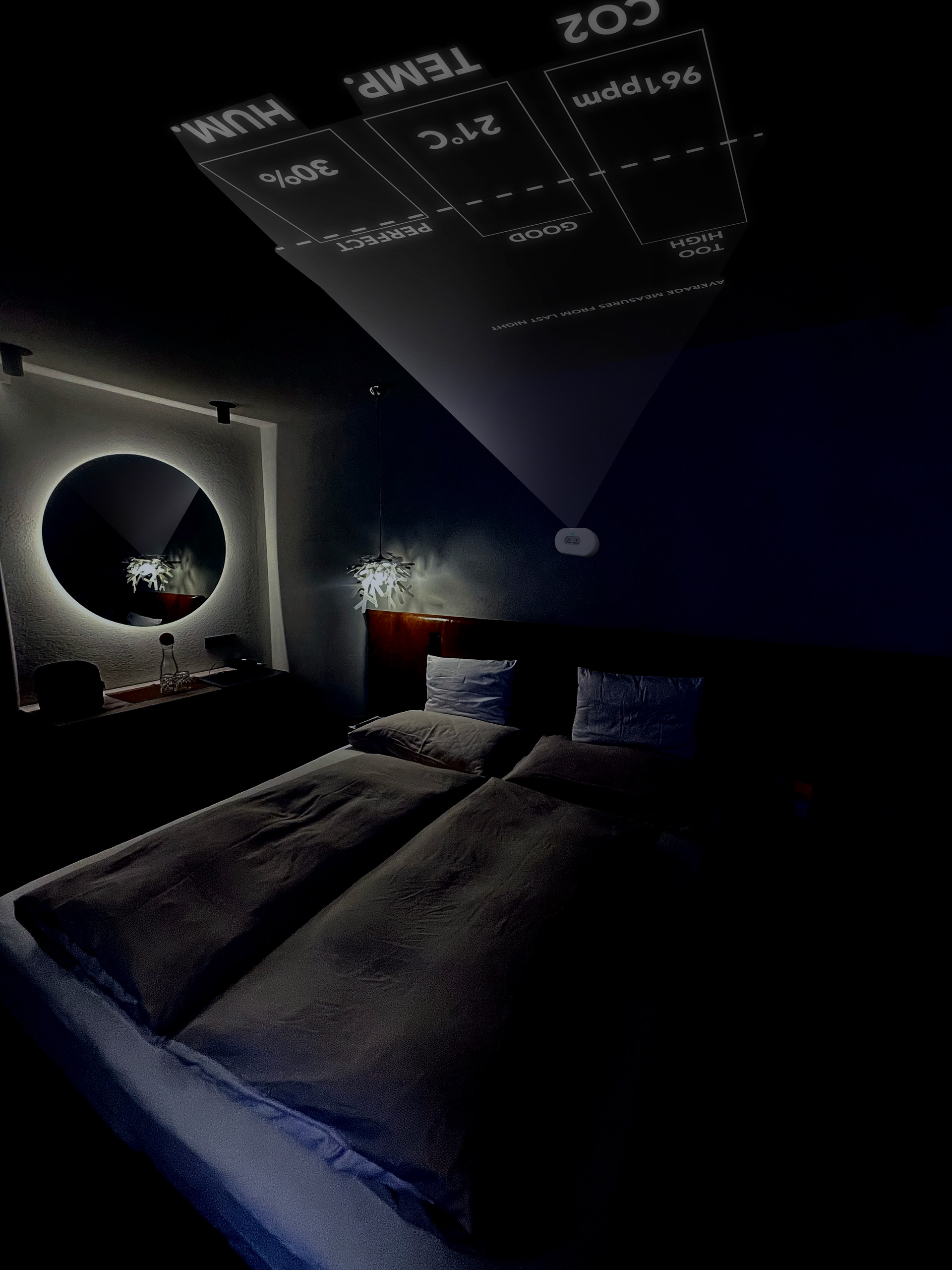


Here is a small user journey sketched out in images, where (1) a user wakes up in the morning and goes over to their (2) Airthing. The then set up their desired calm down and wake up (3) for the next day. They make their bed (4), go on about their day (5) and when the evening approaches (6) they start to see a light form at their bed (7). They do as the Airthing suggest them to do (8) to facilitate for better sleep. They then go to bed (9). Sleep the night through (10) and are then woken up the next day (11) by the stats lighting up their ceiling, fabricating a sunrise for the brain to get a gentle start to the morning. They can now read their stats (12) and quickly see if the arrangements they made before going to bed have facilitated better sleep for them.
And to wrap it all up: A movie from early evening to late morning, to showcase how it might have looked like in real life.
